

Hello,

it's lovely to meet you.
website about hero

I didn’t take the typical path into graphic design. I actually started my design education in Interior Design before falling completely in love with visual communications.

That architectural foundation permanently shaped how I look at design. In interiors, you learn very quickly that a space can’t just look stunning; it has to function effortlessly, guide human movement naturally, and make people feel something. When I pivoted to graphic design, I brought that kind of spatial mindset with me. I treat a multi-page publication, a brochure spread, or a brand system like an environment to be built. I use grids, spatial rhythm, typography, and color to guide a reader through information with clarity and intention.

What I do best

Publication & Print Layouts:

Magazines, brochures, booklets, and menus. I take dense information and turn it into clean, easy to read page systems.

Brand Identity & Style Guides:

Full visual systems with curated color palettes and type rules to keep your brand looking cohesive everywhere.

Custom Logo Design:

Memorable vector marks and typography crafted to tell your story and work across any medium.

Packaging & Covers:

Book jackets, labels, and boxes designed to grab attention on the shelf and feel great in your hands

Copywriting & Editing:

 Polishing words and shaping messaging so your text and your layout work in complete harmony.

icons

My Process

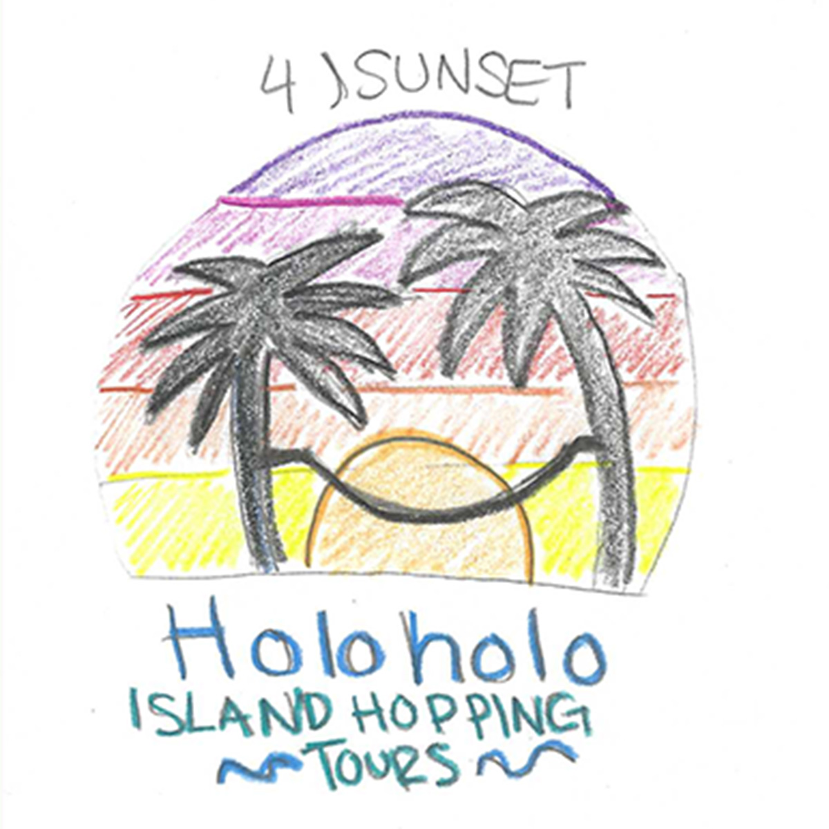
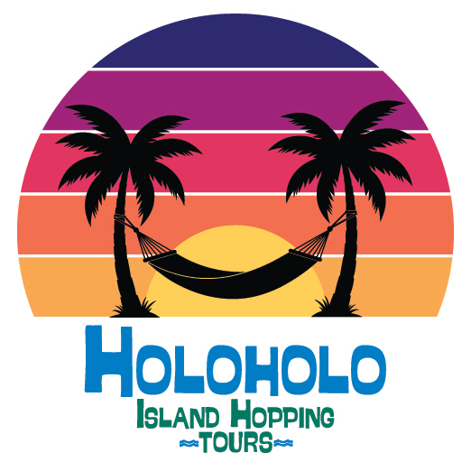
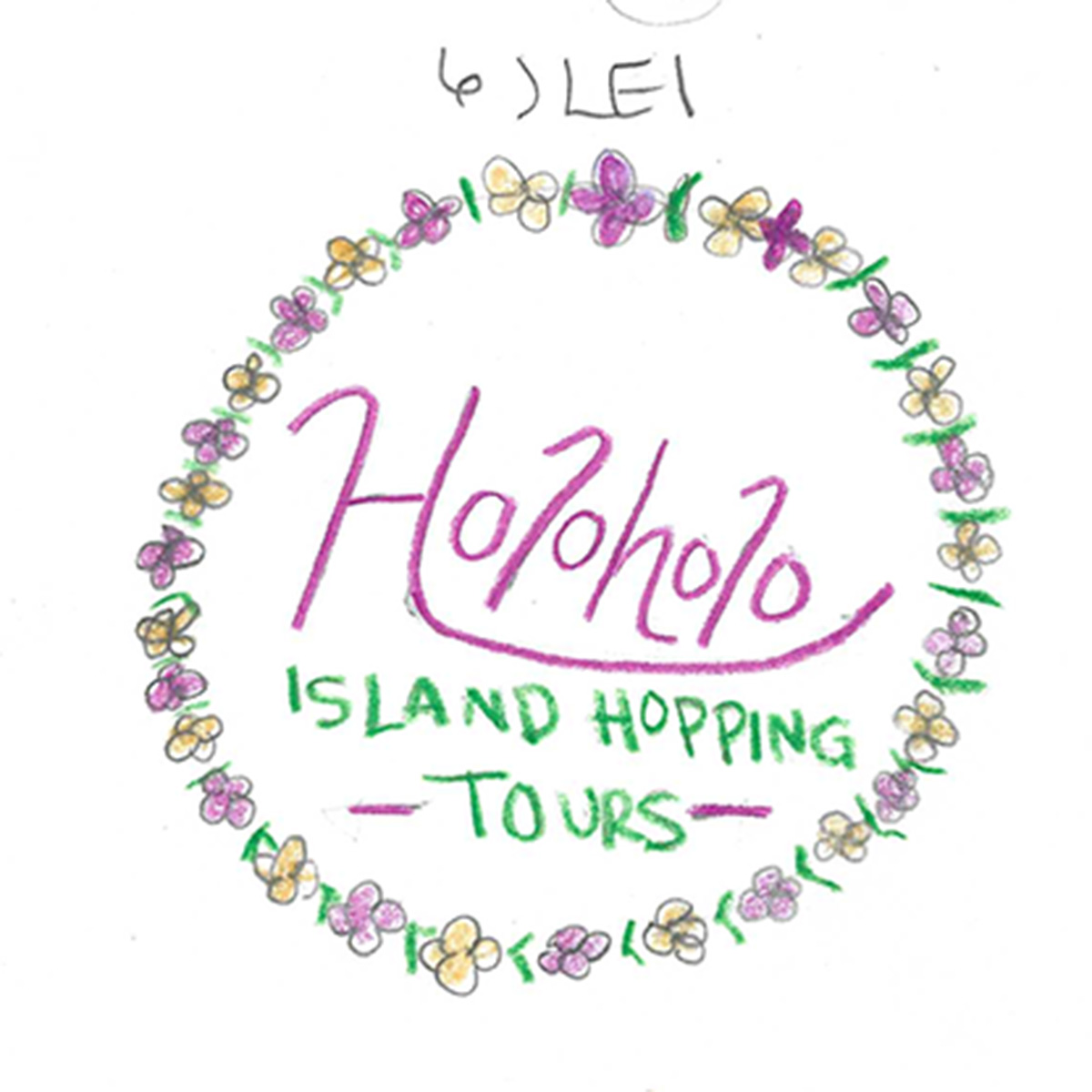
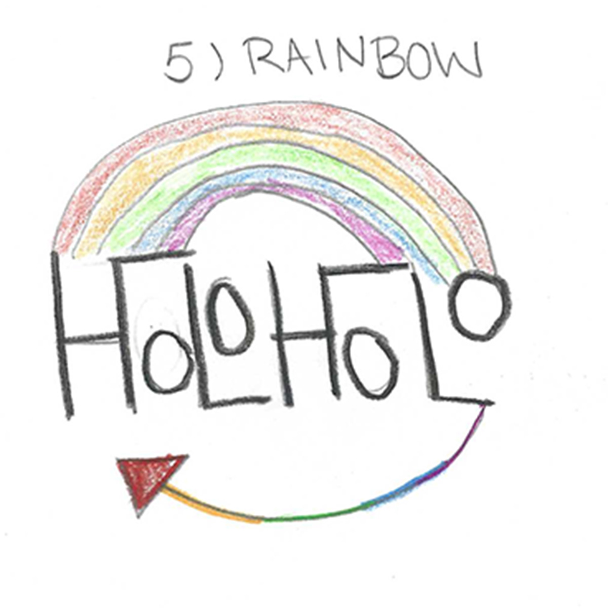
Curious about how a brand goes from messy pencil sketches to a finished, physical print piece? I break down my entire process for Holoholo Island Hopping Tours, starting with vintage surf vibes and moving through grids, vector drafts, and final trifold production

Check out the full case study in the link above to see how the whole system came together.

What I practice

Form, Function & A Deep Love for Color

Good design lives right where form, function, and storytelling meet. Whether I’m mapping out a heavy catalog layout, designing a distinct logo from rough sketches, or writing copy that gives a brand its voice, I focus on the tactile and emotional details that make print work unforgettable

Spatial Grid Architecture:

Approaching the page with structural balance, deliberate margins, and intuitive visual flow so complex content feels effortless to read.

A Pure Appreciation for Color:

Color isn’t an afterthought for me—it’s an emotional anchor. I use purposeful, confident color palettes to set a mood, evoke nostalgia, establish brand recognition, and bring energy to the printed page.

Integrated Copy & Identity:

Crafting words and visuals simultaneously so the narrative voice and the layout speak in complete harmony.

Craft & Prepress Precision:

From paper stock choices to prepress file prep, making sure digital concepts translate into beautiful, tangible physical deliverables.

Let’s work together

Have a project in mind? I’d love to hear your ideas and create something meaningful together. Let’s bring your vision to life.

Scroll to Top